
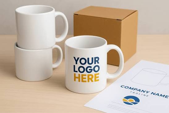
A branded mug is one of the most visible and readily accessible promotional products that a business can invest in. It sits on desks! It travels to meetings! It is used daily!
However, a poorly designed mug is working against the brand it’s meant to represent. Here are 5 design pitfalls to avoid when designing your logo coffee mugs.
Designing the logo too close to the rim
If a logo or design is too high on the mug, it can look awkward. It will stretch or not line up during the printing or wrapping process, resulting in the artwork looking wrong on the final mug.
Therefore, leave some space between the mug and the design. This will allow it to fit on the mug and be visible from all angles. Keep the design centered on the body of the mug with some room to spare from the bottom.
Choosing colors that clash with the mug’s base color
A design may look sharp on screen. But it may end up looking visually distracting when printed on the mug’s colored surface.
A chaotic mug design often comes from:
- High-contrast colors
- Oversized branding
- Cluttered text layouts.
To correct that:
- Start with a monochromatic logo (black). Verify that it reads nicely.
- Select the primary brand hue and a supporting color.
- Experiment to see what works.
- Test against common backgrounds.
Using a logo that is too complex
Some logos feature extremely fine lines, gradients, and tiny text. These details can be too difficult to read on a curved surface. As a result:
- Fine details can blur
- Thin lines can drop out entirely
- Small text becomes illegible at the size it needs to be printed.
If you have a complex design, limit it to a mark, a name, and a few colors on your logo coffee mugs. This is far more professional than a shrunk-down version of a complex full-color design.
Ignoring the handle placement in the design layout
The handle splits the mug into two separate visual areas. When the design isn’t designed to include the handle, it can look like it’s awkwardly broken up or only half seen.
Think about where the logo is placed, in relation to:
- The handle
- When the mug is held in a natural position
- When displayed on a desk or shelf.
Most mugs are photographed and shown with the handle on the right. A design that is centered around the left-facing panel will almost always present better in use and in marketing materials.
Omitting the proof stage
Do not submit artwork without first seeing a proof. Either in person or on screen.
Colors change from screen to print. Proportions that look balanced on a flat file can change on a curved surface. The text may appear large in the design file but very small on the product.
Review the proof before placing the order. It takes a little extra time. But it saves the cost and frustration of receiving a large quantity of merchandise that doesn’t meet expectations.
Summing up
A good logo mug is a great way to promote the brand’s quality every time it is used. By avoiding these pitfalls, the finished product will reflect your brand effectively.





Leave a Reply