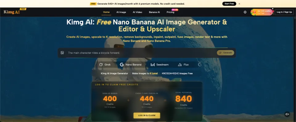
A branded mug sounds like a simple marketing decision until someone asks which color or slogan should appear on it. Suddenly, a small team has six opinions and no convincing way to compare them. Making physical samples for every suggestion is not always practical. A rough visual proposal can make the conversation easier when everyone can see the same idea. Image-generation platforms such as Kimg AI provide one option for exploring product scenes before a team commits to a final design. The important part is knowing what a preview can and cannot prove.
Start With the Decision, Not the Decoration
Imagine a neighborhood café ordering mugs for a winter promotion. The owner wants a familiar cream-colored cup, the manager prefers a green version, and a staff member suggests a humorous phrase. None of these options is unreasonable. The problem is that people are debating different mental pictures rather than comparing one clear set of proposals.
Write down the decision first: Does the team need to choose a color, assess whether a slogan is readable, or decide how the mug should appear in social posts? Those are separate questions. If you change the cup shape, background, lighting, and typography simultaneously, people may choose the prettiest image without noticing which detail actually matters. A useful preview keeps most elements steady and changes one meaningful variable at a time.
The goal is not a polished advertisement on the first attempt. It is a visual conversation that helps people make a smaller, more informed choice.
Three Previews Worth Making Before Ordering Anything
A small set of purposeful concepts often creates more clarity than twenty unrelated designs. For the café, build a simple comparison that covers the product itself, its context, and the campaign message.
1. The Product-Only View
Show one mug against a quiet backdrop with consistent lighting. Ask for separate versions with the same cup shape but different colors or artwork placement. This is the closest thing to a side-by-side product discussion. Check whether the mark remains recognizable from a normal viewing distance. If a generated version adds a handle detail or changes the cup proportions, do not treat that change as an approved manufacturing specification. Record only the design direction you intend to take forward.
2. The Everyday Use Scene
Place the concept on a café table beside a pastry or near the register. A warm, believable scene helps a business imagine how the product fits its atmosphere. Keep the tabletop, camera angle, and surrounding objects similar across versions. Otherwise, one design may seem stronger simply because its background looks more inviting. This preview tests the campaign mood, not the mug’s physical construction. Actual samples still matter for material, print placement, and comfort.
3. The Promotional Post
Test a scene that leaves clear space for a caption, price, or event date to be added later in a design editor. A detailed image is not necessarily a useful promotional image. The mug should remain identifiable even on a small phone screen. Compare the concepts at the size people will actually see online. If a slogan appears inside a generated image, check every letter manually before circulating it; AI-rendered text can look convincing while being wrong.
Where Reference Images Make the Discussion More Useful
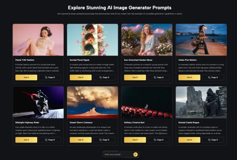
A text description alone might produce a beautiful cup that looks nothing like the café’s chosen product. Start with a real photo of the blank mug when possible. It gives the image tool a visual point of reference, while the written instructions explain the intended styling or setting. Kimg’s publicly described Nano Banana AI image-generation and editing options support reference-led transformations, making this a relevant way to explore concepts rather than treating a completely invented object as the actual merchandise.
For a fair test, keep a folder with the original product photo, the written brief, and the shortlisted previews. Label the previews by concept rather than by subjective names such as “best” or “premium.” A label like “green cup, white mark, café counter” is much more helpful when someone revisits the decision a week later.
Do not rely on the generated preview to confirm whether a supplier can reproduce a color or place artwork on a curved surface. That confirmation belongs in the production conversation.
Separate Visual Approval From Production Approval
A common mistake is sending an attractive concept straight to a supplier with the message, “Make this.” The supplier then has to infer dimensions, colors, artwork files, and print boundaries from pixels. That creates room for costly misunderstandings. Instead, use the preview to approve the direction and a separate specification to approve the physical item.
Your production note should identify the selected mug, the actual artwork, the intended print area, and any color references the supplier accepts. If you have a physical sample, photograph it under ordinary lighting. Make sure the generated concept does not quietly introduce a lid, unusual handle, or finish your vendor never offered.
For a small business, this distinction is valuable beyond mugs. Tote bags, stickers, simple packaging, and event gifts all benefit from early visual comparison. They also require real-world checks before anyone places an order.
Use a Short Feedback Session Instead of Endless Opinions
Give reviewers a narrow job. Show three previews and ask which version fits the café, which is easiest to recognize, and what would prevent publication. Ask for one practical reason behind each answer. “I like green” is useful as a preference; “the white logo is hard to see on this green” is useful as a design observation.
Invite the person responsible for purchasing into the discussion early. They may know that one mug color is unavailable or that the design exceeds the print area. Their input can eliminate ideas without turning the meeting into a creative argument. Set an end point: choose one direction, request any essential revisions, and move to a supplier proof.
Afterward, keep the unchosen previews in a clearly named archive. They might inspire a later seasonal campaign, but they should not confuse the current approval. The most productive review ends with a decision someone can act on, not merely a pile of attractive images.
Check What Your Audience Will Actually See
The final visual should survive a realistic viewing test. Open the promotional mockup on a phone. Can you identify the mug before reading the caption? Does it look like the product people will receive? Is there enough contrast for the brand mark, and does the image still make sense without a long explanation?
Ask someone outside the project to describe what they think is being offered. If they assume the café is selling a gift set when the plan includes only a mug, the styling may be misleading. If they think a limited edition is already available, the caption may need clearer timing. Visual polish cannot replace basic communication.
Keep one approved preview for marketing discussions and use actual product photography once the merchandise exists. That transition protects customer expectations and gives the team a clear boundary between an idea and an item ready for sale.
Conclusion
You do not need a large campaign to benefit from better visual decisions. Choose one specific question, create a few controlled previews, and ask reviewers to respond to details they can actually see. Then return to the supplier for the proof that generated imagery cannot provide. This approach keeps a modest promotional project from turning into a confusing design debate. For your next branded item, begin with a real product photo and three genuinely different concepts, then see which one earns a place on the order form.
Related posts:
 Essential Metrics to Evaluate Before Investing in Oil
 How to Maximize Employee Motivation with Branded Reward Cards
 Why Your Business Needs a Strong Mission Statement
 How Verified Consultants Can Help You Close Office Deals Faster in Bangalore
 How Maya Thompson Turned $100 Into a Million-Dollar Empire
Leave a Reply